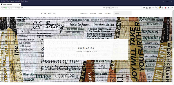
The Pixeladies turned 15 recently, and we decided it was time for a makeover. As much as we loved our website when we first migrated to the WordPress platform, it’s been a number of years since we had this design below. It was called Elegant Grunge, and we especially liked how the thumbnails had frames around them.
Well, nice as it was, it was just starting to look outdated, and that is mainly because of how websites are designed nowadays: large images, fewer sidebars, standard navigation areas (i.e. in the footer), and that ever-precious white space.
We decided to create our new website with the Lamark WordPress theme, which uses the Elementor page builder. You’d think, if you had read our blog post about the new Gutenberg WordPress Editor, that we would be using that instead. Well, it is apparently not ready for prime time, and we decided not to wait for it. Our advisors cautioned against it, because Gutenberg was still not playing nice with all the major WordPress plugins most of us use.
Take a spin around the new Pixeladies website and tell us what you think. It’s an ever-evolving project, which we are constantly updating, but at least we’ve found a new home!
Please note: we’re still trying to make our links more visible. In the meantime, just hover over any word or phrase that might sound like it would link to something, and you’ll see your cursor change shape.


3 responses to “Our New Website!”
Very nice!
Thanks, Franki! We’re still working on it. There are so many little things to fix!
[…] we needed help in that department. Yay, we found a paid theme that did all that and more for us. Here is our announcement about that new website. Weren’t we […]