A few years back we made a piece called “Log Cabin Redux.” We wanted to look at the issues surrounding the idea of “home:” types of houses, fluctuating home prices, locations, homelessness. We paid homage to the log cabin, our idea of the original American home, by constructing the text panels in a log cabin pattern. So why are we reworking this piece? For one, reworking an old piece was also a great way to get back into the swing of our studio work together. And, since neither one of us liked this quilt, this was the one to start with.
The Issues
Here is the original:
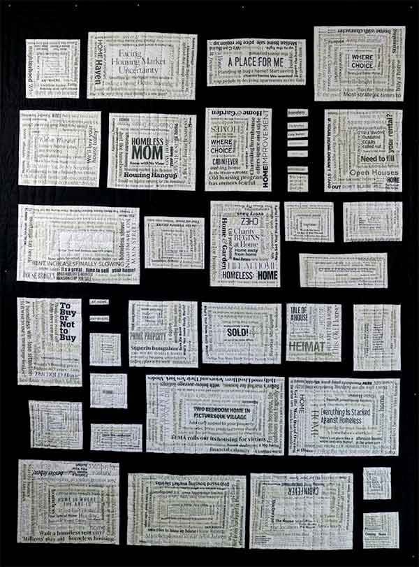
- The Color. Don’t get us wrong. We absolutely love black and white. That is why we picked this original color combination in the first place. But the black and white didn’t add to the appreciation of the whole.
- The Composition. At first we thought having irregularly-sized panels would be a nice juxtaposition to the regularity of the log cabin construction. In the end, not so much.
- The Message. We wanted the log cabin design to emphasize the shifting idea of “home,” but the precision of the log cabin “piecing” in the panels ran counter to that message.
Moving Forward
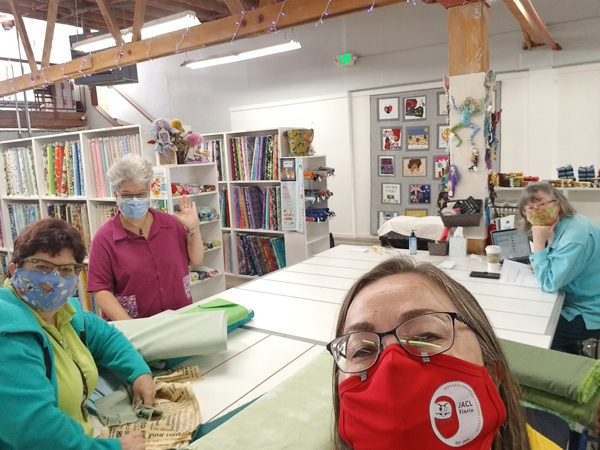
Sometime after we finished the quilt, we decided we needed to do something with it because we really liked the panels and their theme. Deb took the quilt apart and dyed the panels. They sat in a box for a while, and then the pandemic hit. Fast forward a year and some months, and one of our first “field trips” together was to our favorite fabric shop, Bay Quilts. It was nice to catch up with co-owner, Sally Davey (pictured, right), even if we didn’t get to hug. So let’s revisit our three main issues.
The Color
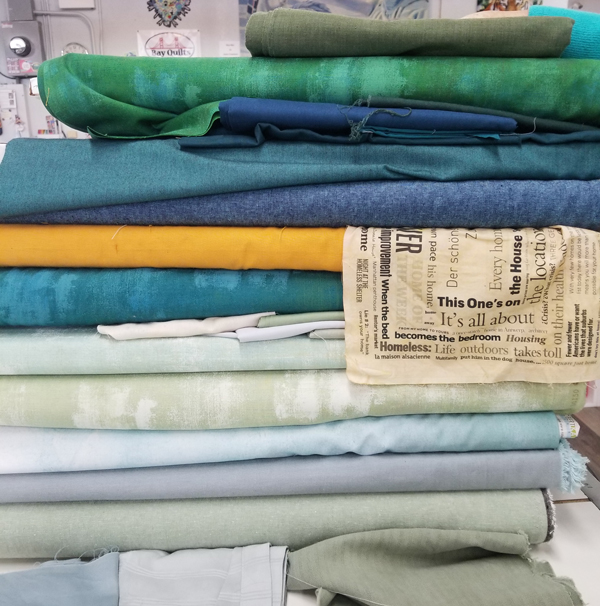
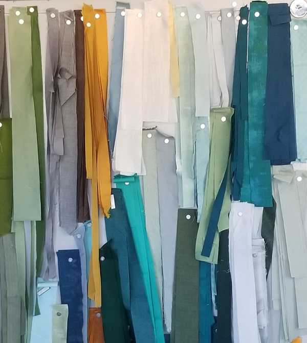
We decided we needed some color. Lots of it. Once we had the dyed panels in front of us, we thought about making the panels the centers of a larger log cabin pattern. We then put the panels on the design wall and threw up some strips Deb had been using for another project. Well, the colors looked just great with the panels, so we looked for more of those colors at the store. Oh, we almost couldn’t stop picking out bolts!
The Composition
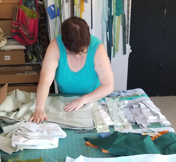
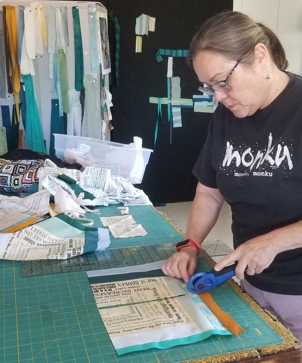
Once we decided we wanted to make the panels the centers of a new log cabin pattern, we had to cut . . . and cut . . . and cut. FYI, if you wear your pedometer wristwatch while cutting, you accumulate extra steps. 😉
After adding some strips to the panels, we felt there was still something off on the composition. Were the panels too large? Still too regular? Deb finally came up with the idea to just cut those dang panels into quarters and then mix them up. Kris was so scared to cut them! But, Deb just kept saying it would work out. She was right!
The Message
Turning the panels into a wonky log cabin pattern underscores our focus on the precariousness of housing. We have a lot of fabric strips of individual phrases that we are thinking of integrating into the quilt. One of the first phrases that we grabbed out of the box says, “trap people in decaying apartments.” With the recent collapse of the apartment building in Surfside, Florida, we now have another devastating aspect to our theme, giving us more urgency to finish “Log Cabin Redux: On Shaky Ground.” We’ll try and keep you post on our progress. We are notoriously slow!


7 responses to “Our “Home” Project: Reworking “Log Cabin Redux””
LOVE the colours!
Thanks, so do we!
So excited to see where this goes!
We are too! Since we want to make it king sized, it will be going for quite a while!
Both of you are so gutsy to take apart a finished quilt! I would
Have “donated” it somewhere and started a new quilt. Love the set you are using now! Keep it up
Thanks! It’s probably less a question of guts and more a desire for a challenge. How can we bring our text quilts and our love of piecing together? We’re having lots of fun!
[…] started writing about our log cabin quilt this past July. You can click here to read about it. We were planning to post progress reports, but we got so involved in turning the […]