A new website, you ask? So soon? How often do you guys update your website, anyway? Hey, those are all good questions. This is Kris, giving you the lowdown on why we have a new website and some tips, if you are considering updating your own soon.
Why a New Website?
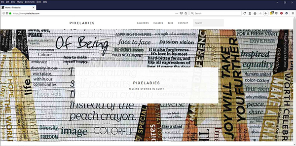
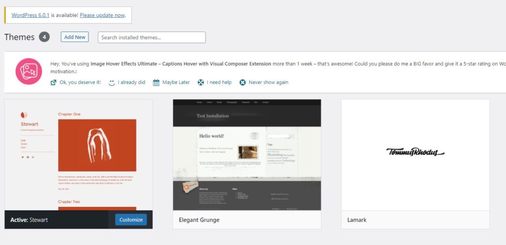
We only do websites out of necessity! Our first website dates back to 2003 (!!) when we started Pixeladies. We used Adobe Dreamweaver and coded some of the stuff ourselves. We had enough knowledge to do a nice, basic site. When our focus changed more to art and teaching, we decided we should update our website. We also decided we didn’t want to keep up the training required to use Dreamweaver, so we moved over to WordPress and picked Elegant Grunge, a free theme – the “bones” of any website. Who knew the developer would decide to travel the world and not update his theme anymore? Ugh. On to a new theme for us.
Page Builders: Yay or Nay?
Flash forward a few years, and we had a our second new WordPress website, which used the Elementor Page Builder. A page builder is a plugin or a theme component that allows users to structure and design responsive pages. People were using their phones and tablets even more, so we knew we needed help in that department. Yay, we found a paid theme that did all that and more for us. Here is our announcement about that new website. Weren’t we happy!

We especially loved the nifty portfolio page. Who knew the developer decided to get a “real job” and stop supporting his theme. Not only that, one of the WordPress updates actually killed the portfolio! (We can’t even show you a screen shot of it.) We were forced to move on. Unfortunately, it has taken a few months to get ‘er done.
Go Gutenberg!
A few years back, WordPress introduced its block editor and called it Gutenberg. (You might like to read our post about Gutenberg – the WordPress editor and the historical person.) As we got accustomed to using the Gutenberg editor, we started to wonder about the Elementor page builder and whether we needed to keep using it. Once our portfolio broke, we decided on one major strategy: KEEP IT SIMPLE!
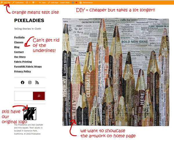
- feature our artwork
- remember the value of white space
- keep navigation simple (rollovers link to more information)
- bells and whistles aren’t necessary

Keep the back end simple too:
- work with the Gutenberg editor
- eliminate unnecessary plugins
- pick a simple theme – in case that person decides to move on! We decided on the Stewart theme. Simple. Customizable.

Use a Staging Site
One could just activate the new theme and make changes while everyone can see you make the changes. That’s what we did the last time we updated. This time, we decided we should use a staging site. A staging site allows you to make all the changes you want so a finished product appears after one click. We chose WP Staging. It’s very simple to use and worth the price. We tend to kvetch about prices, but we were able to get this new website done for less than $200 and some elbow grease.
And one last tip. Don’t update your website alone. We have four eyes looking at everything on the website, and we can’t tell you have many booboos we’ve each found along the way. We hope you like our new look.


4 responses to “Our New Website And Some DIY Tips”
My website needs a refresh but you have scared me off doing it myself. Well done on your perseverance
It does take time. Maybe you have a better use for your time. We are control freaks, so that is why we wanted to do the website ourselves. We want to be able to update the website whenever we want and not depend on someone else’s complicated coding.
Does the new website service the Apple products? (so I can also access Pixeladies!)
The new website is accessible on all browsers. If you want to take Pixeladies courses, you can do so using a Mac. Let us know if you have other questions.