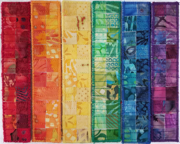
Are you interested in creating color? This is Kris with a confession. I registered for the Color Seminar offered by Studio Art Quilt Associates. It’s free for members. Let’s just say I am a big slacker because I haven’t created anything for class. But, the one thing this seminar has done for me so far is to remind me of the joy of color. SAQA is putting up galleries of art devoted to color. So far my favorite gallery is Orange. I have been bad about doing my seminar homework, but I did create the piece shown above and made some notes on color.
Rainbows for SAQA
While not working on my color seminar, I remembered that SAQA’s silent auction for small pieces is coming up soon. I thought, okay I’ll make a small piece for the auction while thinking of color. Last year around this time I made some bookmarks using small batik fabric squares. Maybe, I thought, I could whip stitch them together into one piece for the auction. But for me it just wasn’t enough to sew the bookmarks together. I needed to spin the bookmarks into a title about reading. That’s when it hit me.
Reading Rainbow
Reading Rainbow was a children’s television series that ran 1983-2009. Its motto was “Opening books, opening minds.” Great motto, great show. I have always loved to read and although I was too old (and my son too obstinate) for Reading Rainbow, I decided an homage to this wonderful show would be fun. As you can see from the image above, I made six bookmarks. Once matted, you will only see one column of the red and purple bookmarks, but that’s okay. Maybe the new owner will just use the bookmarks instead of mounting it as one piece. Now, you’re probably thinking at this point, “But wait! Aren’t there seven colors of the rainbow? I thought we learned ROY G. BIV as an acronym for red, orange, yellow, green, blue, indigo, and violet? I could explain why people settled on seven basic colors, even though we know it’s a spectrum, but Kelly Morr does a much better job of it. Read her post here. For me, six colors are enough!
Three Books on Color
As I mentioned, I love to read, and I love to read books about color. Here are three good ones:
- A Perfect Red by Amy Butler Greenfield (Harper Collins 2005). It is a fascinating history of what was once the most elusive color to recreate.
- Color: A Natural History of the Palette by Victoria Finlay (Random House 2002). The chapters are divided by color. I just started reading up on indigo, since that is that random seventh color in the rainbow. Don’t get me wrong. Indigo is amazing, but the chapters on yellow and orange are just as fascinating.
- Interaction of Color by Josef Albers (50th anniversary edition, Yale University Press 2013). Albers illustrates how color is relative, depending on context. We may realize this intuitively while “auditioning” fabric, but Albers makes the case for developing an eye for color through his color exercises.
Creating Color in Photoshop Elements (PSE)
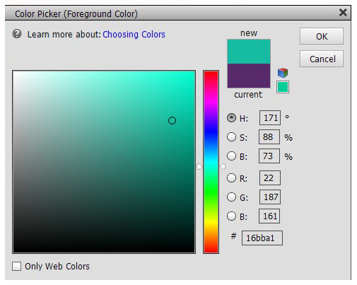
Because the Pixeladies teach Photoshop Elements, I always end up returning to a “how would I do this in Photoshop” question when discussing something non-digital, like my rainbow bookmarks. We’ve blogged a bit about color, most recently on how to create color palettes using Adobe Color. Click here to read about that. You might also enjoy our post about colors, crayons, and Skittles. My question today, though, revolved around recreating a particular color in Photoshop Elements. Usually you click on your color swatch to open the Color Picker dialog box.

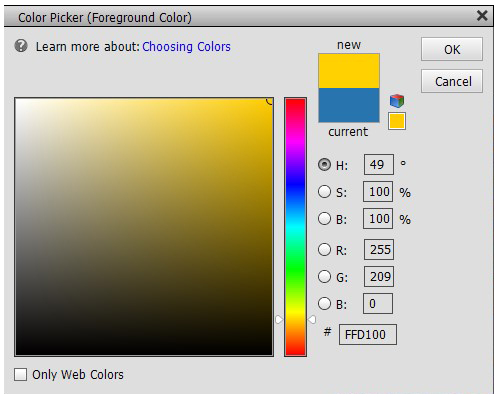
Then it becomes a matter of moving that circle in the color box around and/or using the slider bars in the color bar to get to a different hue. But let’s say you want a specific color. For example, universities today actually provide technical details on their school colors. I looked up my alma mater UCLA to find their exact specifications for their blue and gold colors. UCLA blue is RGB 39 116 174, HEX #2774AE, so you would just plug in either set of values to get UCLA blue. UCLA gold is RGB 255 209 0, HEX #FFD100. Here is the Color Picker dialog box again with UCLA blue as the background color and UCLA gold as the foreground color. (You only see the codes for the foreground color).

There will be times, however, when you’re just looking for some generic colors. In these cases, I go back to the Adobe Color creator I mentioned earlier. Here’s to color!
If you want to learn more about creating color in Photoshop Elements, we just started our series of classes. Click here for more information and to register.


2 responses to “Rainbows, Books on Color, and Creating Color in Photoshop Elements”
Kris, I found something else to add to your color post. There’s a graphic in this article that shows color emotions based on culture. It’s really cool.
https://creativecloud.adobe.com/discover/article/how-to-use-color-to-trigger-emotion
[…] last columns (one red, one purple) are not visible when matted. For more information on this piece, click here to read a previous blog […]